Good to know, thank you for the feedback 
I’m still working on it… Now I’m designing the game goals… Like for level one, everything would be with green gems and easy… and so on. I think that it should be ready by this weekend. Meanwhile if you could… Would you have time to make the game logo for the title screen? “Gem Rain” is a temporary title… If you come up with something better that makes more sense, it is welcome.
Sure, I can work on a logo.  I’ll see about brainstorming some names as well.
Here are some possible other names I came up with. I don’t feel that I’m very good at coming up with names, but if one of these names seems good to you, let me know. Otherwise, I think we can just use Gem Rain, it’s an okay name. For now, I’ll just have some regular text surrounded by gems, so that the text can easily be changed until a name is decided on. I might try to make the letters for the logo styled to look like gems, once a name is decided on.
Possible names
Crystal Cascade
Gem Shower
Jewel Harvest
Gem Genesis
Gem Empire
Gemulate
Gemanate
Gem Rain or Shower is fine. When do you think that you might have ready that logo?
Early tomorrow or possibly later tonight. But not longer than that.
Totally fine by me, Thank you so much!
Here’s what I have right now…I think various aspects of this could be changed, there are a lot of parts that I’m unsure about. But I’d like to know what you think of it so far.
gem-rain-logo.wick (95.7 KB)
Basically, this is what the design looks like, with all the gems used:
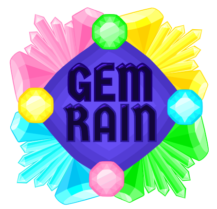
And here’s the design without the round gems:
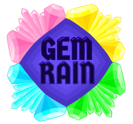
I liked the idea of making a border of gems around the logo text, but I had difficulty figuring out how to use the round gems in the logo. Also, I’m not sure about the text. I should probably work on the shading more, at least. I can work on the logo more later today.
Thank you bluecake, this is definetly a good start. I think that the letters should contrast more… like if they were white.
Okay, I’ll make some edits with that in mind 
Sorry it’s taking a bit longer, I’m experimenting with different font types. I recolored the text to white since that was easy enough to do, but I think there must be a font that works better than the previous one…I was only using Wick fonts earlier, but right now I’m importing different fonts into Wick Editor to see which ones look best. On a side note, if there is a particular kind of font that you think would be good for the logo, you can let me know.
Maybe something like this? I think this font fits a little better:
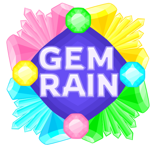
I’m trying to decide if I want to add more detailed shading or anything like that.
It is better. I’m really thankful for your effort… I loved the letters, I can use them. I’m not so sure about the rest. It is too much. I think that I could use the letters with the 4 rounded (top-view) diamonds.
I’ll work hard to have it completed to at least Sunday night. 
Understood, it didn’t take too long to make so don’t worry about it. I also thought maybe it was too much, I was trying to use all of the gems, but I don’t really think that’s necessary…I can try to come with something simpler (of course, you’re welcome to edit the logo as you see fit as well)
We have time… usually the main screen is the last thing that I work.
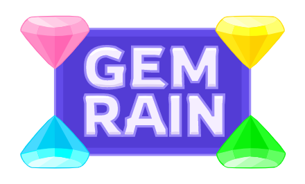
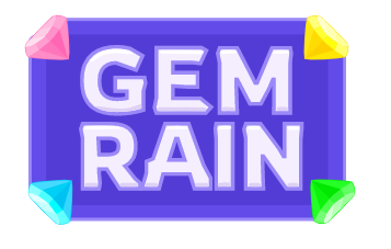
I made two more possible logo designs which are much simpler:
gem-logos-simple.wick (45.9 KB)
That works!!! 

