Ah, good catch. Thanks again for the feedback! Now working on those suggestions
i cant find the gradient tool
Can’t wait to try it later :)
It opens when you select something and click the fill/stroke color buttons in the inspector
btw, I finished all of these and they’re being deployed now! it usually takes 10-15 minutes to appear on the test page
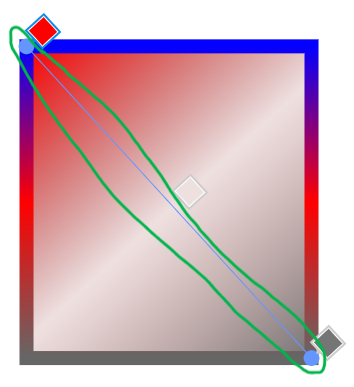
Great update. The new version feels more professional than the old one. My only ick with it is that you have to choose SPECIFICALLY the color part of the picker for you to be able to change it. I suppose that a design like this:

Artist’s Rendition, made with MS Paint
Where the position pickers and color pickers are combined could make it simpler to use.
(nice rendition!) Do you mean remove this part

and make it look more like the old one?

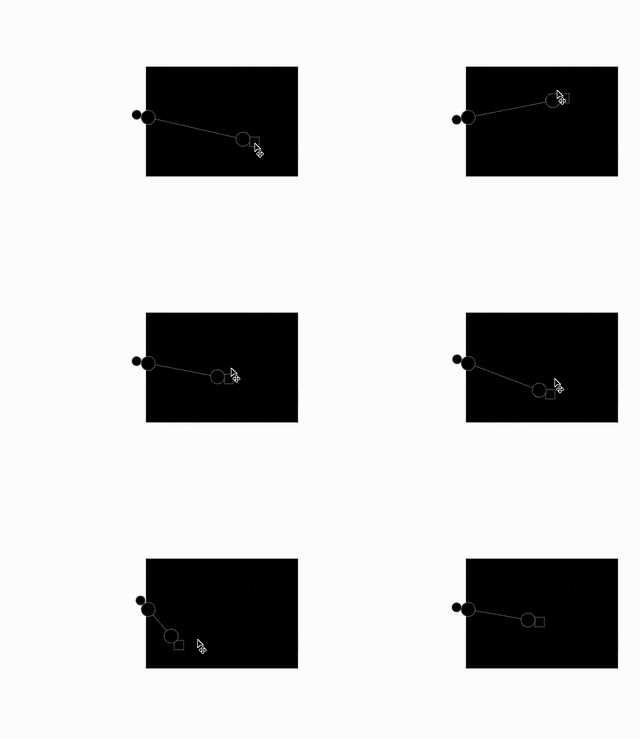
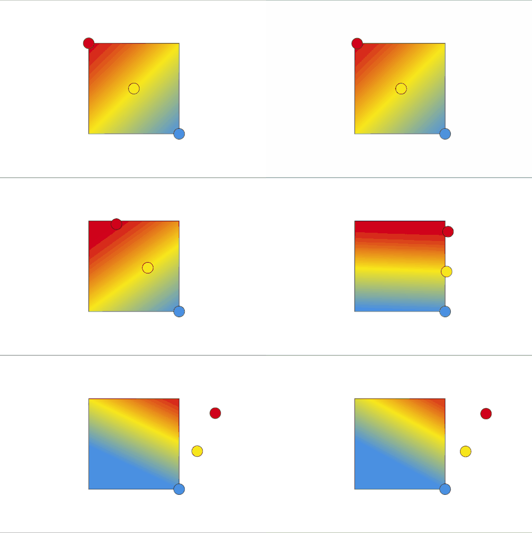
well i think the issue you run into with this is that if the gradient stop is all the way at the end, you cannot simultaneously move the endpoint of the gradient and the position of the stop along the line.
it is technically possible to put the endpoint grabber past the endpoints, but that feels a little… weird. because then, the position of the grabber does not accurately reflect the position of the endpoint. which, y’know, kinda ruins the point.
actually, this seems to be what stickmanred does in his non-test fork. the gradient endpoint grabbers kinda orbit around the actual endpoints.

meanwhile, for tools like figma, the worst thing that happens is that the swatches move around (which in a way is actually fine, cuz it sort of tells you which way the gradient is going)

I think making it more like the new one, but I have an aesthetic idea.
What if the selected stop is square, and the others are circles (or reverse).
maybe it’s just me but i kinda just like how the one in figma works. in terms of UX it feels a bit unwise to make 3+ grabbers work in 2 different ways.
(also what happens when the gradient stop is not at the endpoint?)
edit: turns out, the simplified gradient grabbers look surprisingly similar to how affinity does it. so actually it’s not that far-fetched. (though i still like the figma way lol)
edit 2: also, stickmanred’s original version with the orbiting endpoint grabber seems to work just like illustrator. so like, there are a lot of ways this can go… which could warrant a setting for it, idk
bro I WISH I could use your fork, this would be so useful bro 
Yeah, I referenced Adobe Illustrator for my fork.
I think the Figma-like UI is okay for now, but if many users find it unintuitive, it’ll be pretty easy to switch out. Thank you for the feedback @BaronAWC and @noobfield! :D
is wick Editor or any wick Editor fork tracking me cuz I got this
![]()
also u should change the UI a bit and make it look like procreate or procreate dreams
apparently there used to be google analytics but luca removed that right before he left.
i can tell you that the only info we get is github telling us things like how many people visit the site (which from my understanding isnt even that accurate). other than that, we get absolutely zero useful data.
aside from it being kinda hard to add detailed analytics, i really hate data collection and ads and all that, so its nice to have something that just works for you for once.
the core ui is going to largely stay the same. procreate is a raster art app and procreate dreams is a raster animation app, which means its ui is fit for those cases. wick/candlestick is designed for vector animations and games so it has to account for things that procreate cant.
if we ever add customization we will most likely model it off of flash, since thats what wick kinda derives from anyway. sticking to a consistent ui is generally better than needlessly changing it, cuz we’ve all developed muscle memory for the current interface by now.
yeah I don’t really mind seeing one tracker,
yeah the UI is already good but for iPad or mobile it feels cramped up or any small monitors
actually yeah you bring a good point for mobile. i think itll be pretty similar to how it currently is looks-wise to stay unified with the desktop version, but just simplified or otherwise cleaned up, which could possibly borrow from procreate.

