Meeting Web Design Contrast Standards

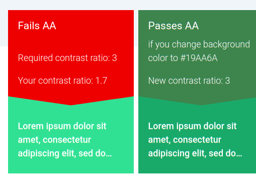
The Web Content Accessibility Guidelines is a series of guidelines recommended by the W3C that makes web content easier to interact with. Specifically, it recommends a contrast ratio of at least 4.5:1 for normal sized fonts. This ensures the content can be read clearly, especially for people with impaired vision.
(More info here)

A few objects on Wick fails the contrast requirements. Examples include the bright teal links on the main page and the icons in the editor timeline.
image
Fixing this simply requires tweaking a few colors. You can check them at accessible-colors.com or pretty much any other online contrast checker.

1 Like

Great catch here @XYZt,

The current website definitely has some problems. We’ll be launching an improved version soon, and taking these contrast guidelines into account before the final launch!

Is the new site’s development in another repository? The old site under Zrispo’s account hasn’t been updated for quite a while.

Hey @XYZt,

The new site is in another repository! We had it there so that we could take care of any issues and will most likely be making it public once we finalize the launch of the site.

For now, you can view an in-progress version, which we plan on launching this week, at new.wickeditor.com. We still have some kinks to work out, but it should be all ready by Friday!

Also, the landing page and menu bar have a few contrast issues we’re working to fix, any suggestions on color choice would be appreciated.