Minor and/or major annoyances with 1.19

the issue has a picture with the description below. this probably isn’t everything.

don’t take this threateningly or whatever, this forum is for reporting bugs and whatnot. I’m sure the mods know this already, but this is for the others.

now, enjoy this long chunk of images and text.

le stuf


the project name isn’t centered. not to the window, canvas, or anything.


the dropdown menu isn’t always needed-- there’s plenty of space on the left.
Screen Shot 2020-11-10 at 4.23.18 PM
the indicator goes off-screen in some places, and it’s not center text. (yeah that was picky of me.)

Screen Shot 2020-11-10 at 4.36.23 PM
the gap and frame settings, as well as others, aren’t saved.

Screen Shot 2020-11-10 at 4.40.26 PM
with the skinny screen, the tools compact even when there is no reason to.
Screen Shot 2020-11-10 at 4.44.33 PM
I prefer that the thingies like this one are separate, more like the way it is in 1.18, and not like this.

Screen Shot 2020-11-10 at 4.45.48 PM
the letters in timeline and random spill out a bit
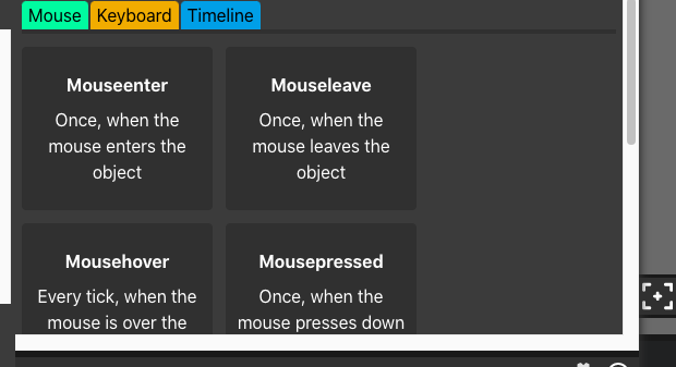
Screen Shot 2020-11-10 at 4.46.51 PM
the buttons are super big, and maybe the buttons can resize themselves when there is a space.

Screen Shot 2020-11-10 at 4.48.44 PM
the tabs scroll at the top

Screen Shot 2020-11-10 at 4.50.23 PM
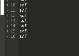
there are 30 lines, but only 16 at a time render. i think this is to save space, but when you expand the editor it shows emptiness.
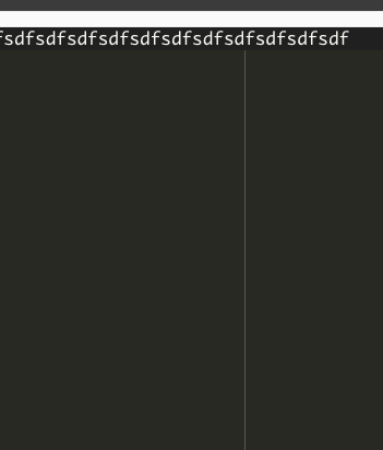
Screen Shot 2020-11-10 at 4.53.04 PM
random line??

Screen Shot 2020-11-10 at 4.53.31 PM
darkened line doesn’t continue

Screen Shot 2020-11-10 at 4.54.03 PM
should these be in editor settings?

Screen Shot 2020-11-10 at 4.55.45 PM
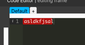
the red part doesn’t highlight the whole thing (off by a bit) and there’s no error message, not even in the console.
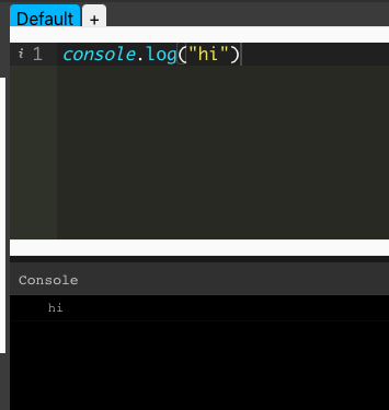
Screen Shot 2020-11-10 at 4.57.22 PM
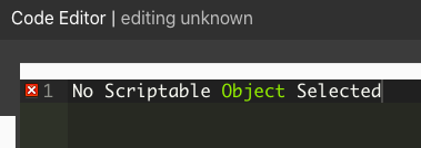
(image is what you’d expect to see after running code and opening code editor again.) when running projects, you won’t see the console. there should be a place to open the console when the project plays. (you can also play the project in the code editor. you’ll see the console, but it’s unrealistic to have a giant window there at all times.)

2 Likes

First of all, that’s a great list :D

I think the console should be visible in the inspector at run time since the inspector is inspecting nothing when the project is playing

1 Like

all of these images belong in r/mildlyinfuriating

2 Likes

I agree. The UI is kind of a mess right now for the test/1.19 version. I appreciate the effort, but… They are working on things to make the editor prettier, but I think that most of these changes are worse than before.

Now they have to invest effort fixing all these, in reality, these things don’t add value to the editor. The console is a great addition though, but they have to fix that problem that you are mentioning… There are so many other things more important than making the UI better (better than 1.18 which is ok), hopefully they could focus on those.

1 Like

Thank you for the list, I will review and try to get to these issues. A number of the UI changes we made in this version attempt to fix problems that we’ve seen in public/private playtests, more specifically for beginners. One of the best parts of the Test branch is that we can use it as a test bed, and fix these problems before they go live.

2 Likes

I also have a few suggestions that can make the site better. First, maybe you could make a feature like flash that when you press F7, a new frame will be made. This would be a nice feature so that you don’t have click the add frame or click the timeline when creating a new frame. Secondly, maybe there could be a better V-Cam, I tried it out but it doesn’t quite work like what I’ve seen on adobe animate, and is mildly annoying for camera zooming in and out. Lastly, maybe you could add a feature that you could make a symbol, like in adobe animate. This is just feedback, you don’t have to put them in but just thought that it would make the site better.

2 Likes

There already is a shortcut for creating a new frame(Shift + 8) but F7 would be more convenient.

+1
at present all elements on the canvas appear to be new objects. changes on any one of them never reflects on the others. this led me to think that also performance wise there is no gain in using again the same clip.
the main advantage of using symbols is to reduce memory usage thus allowing many more objects on the scene. I noticed that paperjs has symbols

not only that but if you change a symbol it will be like that in every instance of the project.

But can’t you edit shortcuts already?

yes but every time you leave the editor, your shortcuts reset.

Oooh, in that case, the problem would be that, not changing a shortcut for everyone but leaving the shortcut you like saved so it doesn’t reset.