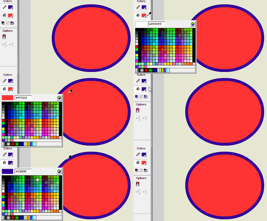
Overall, I really like the improvements in 0.07.
- The eyedropper feature is awesome and a huge timesaver for maintaining harmonious color palettes in your work. I do the same thing all the time in Flash. One thing that would make it even more helpful is if the color in the “new color” box at the bottom and the hex code for it start live-updating with whatever is under your eyedropper (again, like Flash
 ) That will also help you make sure you’re selecting the right color and not an anti-aliasing pixel, which I think happened to me once. (Or maybe it was a bug?)
 - I really like the minimal palette. 12 nice, basic colors is a lot more manageable than Flash’s 216. The custom color box is a part of the color picker, so in hindsight, there’s no need for a laundry list of colors when you can just make your own. (In my ancient version of Flash, on the other hand, there are 3 separate color-related windows. Picking a custom color and adding it to the swatch list are in separate windows, which complicates things.) That’s one of the areas where I’m glad Wick innovates. I don’t want it to just be “Flash 2: This Again?”

- The new brush and line thickness controls look great and so does the new stroke color button. I smiled when I saw them; their look has improved so much. They, along with the new zoom function, are intuitive to use.
- There are some bugs, but I reported them on GitHub.

 ) That will also help you make sure you’re selecting the right color and not an anti-aliasing pixel, which I think happened to me once. (Or maybe it was a bug?)

