thanks for your feedback  so…i reorganize it and add some notes :
(welp I didnt give wick file right now…due to low internet problem  )
)

thanks for your feedback  so…i reorganize it and add some notes :
(welp I didnt give wick file right now…due to low internet problem  )
)
Here is how the cards (tanks and enemies) looks like at the beginning of every stage… (so you can use them as reference)
In the gameplay (my part)
I’ll add the yellow magic at the beginning of every stage and the tanks and enemies appear slowly…
Similar to what you have in here so the intro and gameplay match : )

I think that you can try to put every animated section into a clip and animate them individually, so you don’t have to worry about the transitions… I can add the transitions programatically. (I’ll also add some sound fxs… it will be cool!)
thanks >w< jovanny :D for helping …  i didnt know that you could programmatically transitions (thats makes me so glad (cuz i didnt have to animated the transition ) )
ouh and
update: …i also organized the box (so each box got their own layer) (it makes my work easier) :
wick file :
cutscene 1 (v2)6-13-2022_11-04-17.wick (1.3 MB)
I have a idea for enenmy. so the enemy when spawned will be invisisble unless the tank is aiming at it. when the tank aims at this enemy the enemy will jump up and down and thats when the tank can strike.
@MrDashell
Drawings / design should be better for me to visualize things… but first… I was expecting you to enhance / redo your first enemy submission… Could you do that, please?
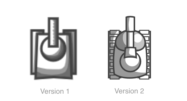
i uhhh. tried to make the design look better… the line in it was based off the zig zag movement pattern… im not really proud of it… so that probably means it isnt good…
It is definitely better, but what it is?
and, Why do you want to share something that you are not pride of it?
Here is version 2 : )

Looks Amazing!
welp… i just want to ask about the animation feedback ,here the progress so far (animation finished …) :
cutscene 1 6-14-2022_16-48-34.wick (2.3 MB)
(i didnt know why i cant send gif (’’…there was an error uploading that file…’’) …so i put gif here later)
Really good job… It is getting better and better. Thanks!
Since the 5th section is the one needed to transition to the main gameplay scene, lets do this small change.
To have a cleaner and more understandable picture of what is happening… let split it into 2 small scenes sequences… The first one with sections 1 to 4. and then the second one to transition to the game containing only section 5. Just right before the game starts… Section 6 can be use later.
(remember, I can do the transitions programatically… just animate each section individually)
first of all, thanks jovanny for the feedback 0w0…but I little bit confuse of this :
errr?? is it mean…that each box is clip that animated …like i did in the wick file ??
:D
Not necessary, just every box animation should be inside a clip… I can later add the transitions… What I mean is you don’t need to animate the order in where the animations starts… I can do that programatically.
ouh… :o so…thats mean that … all box (clip) in one layer?
Don’t worry, just leave it as it is… that works as well. : ) Thank you!
New enemy idea: A Mortar
References:
Wick File:
Enemy Design - Test2.wick (7.3 KB)
Wick File (Black & White version):
Enemy Design - Test2.wick (7.1 KB)
The wick file is only to show how this might work in the context of the game.
Here’s an example of a mortar used in the real world (no need to watch full thing).
The mortar:
Advantage:
Disadvantage:
This is a simple idea that might need some adjustments, I’m not sure if it’ll work well
The drawing of it I made is from top view and it’s not so perfect so it might seem confusing
That’s why i added references to this post