Phew, had me worried
Also where did you get the name Rohstedye from and what does it mean
It doesn’t really mean anything, I was trying to make a cool song name based loosely on a word. It was initially called “Junk Teddy”, but then i changed it to “Rusteddy”, which in turn became “Rohstedye”! :D
This process usually involves me trying to make pun names.
yayy
I wrote this depressing-y wrapup monologue for the end of story mode before the credits roll
Hey, you.
Yes, you behind the screen.
That feeling of accomplishment you have? Sometimes it can be crushed by the acknowledgment that it’s over
Everything is done
You’ve saved countless people, you’ve done good today.
Don’t worry
I’ve been there before
Cliche heroes n’ stuff
It’s all going to be okay
Well, i think it’s about time we just…
(Slowly Fade to white then Cue credit music)
we’re not even writing the ending yet. :| 
We pretty much have an outline back at the document (thanks Baron!) but otherwise we might have to start writing out the character chapters.
I just came up with it and wanted to get it out, ill bookmark it for later use.
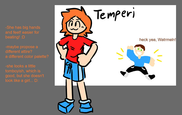
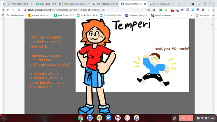
So I have an idea for a while now what Temperi could look like:
Temperi.wick (74.6 KB)
I also made a Watrmeln doodle for fun. I had a reference.
You guys can propose a different idea btw.
yooo that looks sick :O maybe if you just make the hair longer it would help. because generally, girls have longer hair. (not promoting stereotypes or whatever it’s called.)
I added my own idea to my chapter of the story. scroll down a bit until you reach “The story outline […]” in orange at the bottom of the first page. go to my chapter and find the 2nd bullet under it, it’s in blue.
really cool i think she looks fine altogether CHANGE MY MIND but it all comes down to what you would want the most.
also if we do more then 10 characters we should make a smash bros like character select so we fit in more people because i really wanna make 2 characters: a yo yo master and a shapshifter
fixed this, for some reason the frame was bugged, I also added a bit more dot scene back to the intro cause it was possible to overlap the intro and menu music if you had a god computer
FFR 1.3.30 (patch1 - back button fix)5-26-2021_8-58-13.wick (1.4 MB)
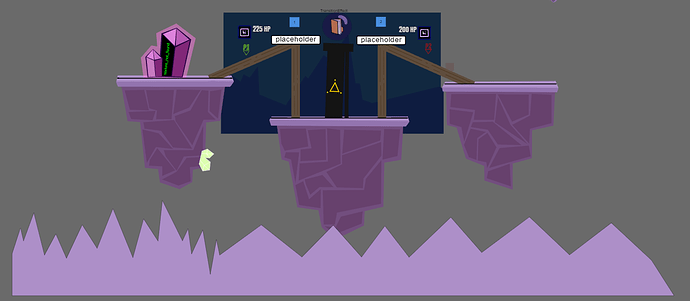
Also: BUG ALERT!!! Sometimes pressing “arena” on the character select screen doesn’t work and selecting a character other than baron or pk for p1 makes the game crash when the GO! appears on screen
And what’s the art frame for?
you need to contribute first (enough to get a character), and if you end up getting a character, you’re only getting 1.
i think tryobyte wanted to add art there or something.
like original forum fighters art, like pics of characters and maps?
honestly, i have no idea. my initial thought was that it would be a background, but we already have one. so maybe it’s character art or something.
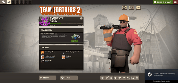
explanation and intention for the art frame
example:
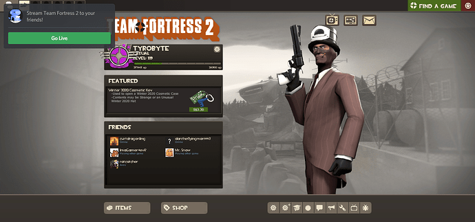
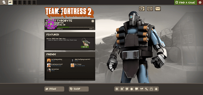
this is me starting up the same game 3 different times
subtle differentness that give the game i have played for 642 hours a fresh look every time
ok, we’re gonna need a lot of stuff then to make it “fresh every time”… is gonna be a mix of some random things in the game? (character renders, character stats, random behind the scene screenshots, etc)
nonono, we dont have to have so many. we just need maybe around 15 to 10
enough to cycle between them. enough to make the player forget the first of they saw
It just randomly selects a frame like in Square adventures’ tagline system?
regrading @KringlePrinkles 's temperi design
veri gud work kringles!
i encourage you to go do some T&E (trial and error) on some clothing, design and colour pallets.
be overall its a pretty good design to start off with!
The “heck yea watrmeln” you dropped in was also pretty funny
But that’s beside the point, you did an amazing job on the design, also heart this post if temperi is a play on temporary, it also sounds like “tempera” paint
Also nice cube shoes, they look cool
oh yeah, about kringle’s new design, we also need to animate that… not just in the fights but in the scenes too. and for the sake of consistency in design, you might have to do all that…
also, about the story, um, how big is this going to be? like, we need music for the scenes (and arenas), we need high-quality animations for all of them, we need all these cinematic movements, we need dialogue, whether spoken or said… how will we tackle this?
i think if we already know it’s not going to be practical, we simplify it and put people in bigger clusters than just 1 or 2 at a time. that way we can have less of the get-out-of-this-trap-or-dimension-i-got-into stuff.

