I think the choose-your-weapon thing is too messy. it’s not impossible, but considering this is a game made by a bunch of random people who don’t know each other, etc, and we have barely even touched story mode, I think it’s a bit far-fetched, for now at least.
oh yeah im working for a background that looks good to me but idk if it’s good to you guys and you can use it in the game
But couldn’t you just explain to us why it looks bad?
Is it the cartoony style that doesn’t look good? are the colors too flat because it lacks proper shading (i think)? Is it how I and we’ve rendered the art that makes it look bad?
this response is not enough as an answer. It’s clear that it’s your opinion, but that’s not enough to explain to why you think it’s bad, unless you’re just commenting about it:
It’s clear to me (I think) that you’re trying to critique it, if not vaguely.
I’m going to try and guide you on how you can write good criticism, whether it’s positive or negative:
First things first: Observe our backgrounds (or whatever media it is) and think about it.
Since we’re talking about Forum Fighters’s* background art:
What quality do I think causes this background art look bad, or what flaw brings it down? Do I have a style that I like that causes me to still think it’s bad, and is it affecting my thoughts on it? How can it be improved, or how would I go about making it look better?
Next things next: Writing the criticism:
So you’ve identified the flaw, and now you have to write it. Make sure that you take the time to write the post, so that it will be clear and easy to understand. Include an explanation for your criticisms, your ideas and suggestions to how it can be improved, and add clarifications if necessary.
Be sure to review everything after writing for any edits you can make.
Then you can post it once satisfied.
I explained to you how you can write good criticism (positive or negative) because I assumed that you might not have a good idea how to do so. I assumed alot of things so I may be wrong…
…I may have been too on the nose there, and be VERY wrong and shouldn’t have posted this, so call me out on it if it was a bad idea.
edit 1: …You can still make the background by the way, I’m curious to see.
*Forum Fighters is a place holder name for our Wick Editor platform fighter game, and it will be replaced with a different title eventually.
yeah it was cause of the shading and all of that i might remake the tree background
Alright, this looks pretty good. We should probably just un-brushify it (meaning we should use more geometric shapes when applicable, like the background, or at least fill in some tiny holes in the buildings*). And the island is tilted and I still can’t make slopes yet, so we should rotate it back to being flat.
Also, just some random idea to make this arena not plain (it’s just 1 rectangle platforming-wise), should we make the clouds also platforms that move horizontally?
*this is what I mean

well I didn’t put any code into this so you guys can code/add whatever you want also on frame 2 I put the floating thing without being a clip
also im kinda bad at making backgrounds each time i draw something i always leave the background white
So I applied Breidy’s suggestion:
just click here for the gif, it wont load for some reason
don’t worry about the lack of Biggie Tree’s face, it’s just the gif quality.
HAHAHAHAHA! I finally figured out how to make them bounce when hurt (and when they have a velocity bigger than 10)!
So some things I’m trying to do now since I finished the recoil:
- disable and completely remove the fighter’s processed attacks and recoil when hurt during an attack
- add some kind of platform checker for the ai (using a hitbox) so that it can jump off the ledge with confidence that it won’t fall
- Check if the player is directly below it, and go around the noPassThrough platform instead of standing
So some things I want to do after the above:
I’m going to post the mini update later once I finish the cloud platforms though, since I don’t want to hog working on it for too long.
Edit1: I got a bit carried away but here’s the mini update
FFR 1.4.35 (PKhead and Recoil Fun)6-27-2021_18-17-17.wick (1.8 MB)
new things
- pkhead IS REAL! YESS
- (pkhead is probably a mobile bruiser, compared to Baron who can attack sufficiently by being precise… Hopefully they’re both not too hard to play)
- Recoil now acts like hitboxes: You can edit it’s properties and make silly things
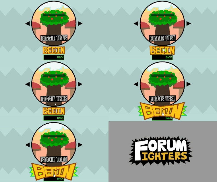
- Improved the look of Biggie Tree’s arena (and changed his happy animation)
- It also has 3 randomly spawning cloud platforms.
- Made the Title Screen look more colorful???
- If it’s too much, we can always revert or change it.
- Character select is now interesting… as in I finally figured out how to make it animated
- Improved Watrmeln’s Arena 3 thumbnail
- Begin Button looks very VERY clickable… could be bad…

bugs:
- Attacks and Recoils don’t cancel when hurt mid-attack
- didn’t manage to improve the bot a whole lot… not a bug but it’s something
 …I might’ve forgotten something…
oh right now I remember-
They now bounce when the fighter is hurt and has a velocity bigger than 10, “as seen in these text in quotes”
Off-topic note of why Imma leave da forums
Hi guys, I feel guilty for being inactive for this long.
However, I may never come back online - I had lost motivation to code after finding out some stuff that happened in my family - I don’t feel like sharing that here, so I won’t mention more :/
I will definitely get back to coding at some point. I’ve had big plans for da future that I hope don’t get ruined.
That also means I’m leaving Forum Fighters. I feel like I didn’t help enough in the new FF as I did in the old one. But you guys are making great progress, so keep it up!! Oh, and feel free to remove or replace my character (I hope that you guys do)
I also know that I (somehow) am one of the only leaders in this project… @BaronAWC is good with coding, and @mlgcoolguys_1 is good with pushing the team forward, so I insist that @KringlePrinkles takes my place and becomes the third leader since he’s a great animator/ artist! (If I do come back, then I’ll just be a normal member of the team, I never wanted to be a leader in the first place ¯\_(ツ)_/¯ )
Well then, have a good day everyone!
Hamzah, I unfortunately don’t have much to say, but I wish you good luck in whatever is happening over there. Whatever emotions you’re feeling, just feel them for a while, then get into action. I can only imagine what’s happening over there, and I don’t want to pry or assume.
Just stay safe! please… 
Meanwhile, I have no idea what I was thinking, editing my old post...
Don’t mind me, just being your local scatterbrain friend (or co-worker, rather, since we’re all collaborating on this, although I do assume we’re all on friendly terms)
Although… What do you guys think about this?
Your the one putting in the most work~
So yeah! You are our new leader!
Godspeed @Hamzah_Alani . I wish you the best wherever you go.
I’m all in for Kringle taking Hamzah’s spot. @Hamzah_Alani whether you will see this or not, I hope you and your family resolve that issue.
I think the only few complains I have are:
- the “begin” button is very out-of-place. of course, we can redesign all the buttons, but in this state it doesn’t really work.
- the numbers on my shirt aren’t supposed to be on the back…
- the 3 clouds in arena 1 feel very out-of-place and don’t really add much.
- the “winner” page seems to always display the 2nd player, not the actual winner.
- those polka dots… how bout we put the project leader names there? (you, me, tryo)
and maybe we should pay tribute to hamzah (and mojad for that matter) in the credits…
Since Hamzah doesn’t want Flambe in the game, we have an empty slot on the boy’s side (probably). (2 free slots on the girl’s side, since Baron wanted to have gender equality).
So i guess I’m the art Lead now 

Do we write something like "Thank you, Mojad and HamzahAlAni, for helping us out while you're part of this team," do we make a portrait for them, or is there a better way to go about it?

Meanwhile, for my end of the day report that I couldn't post yesterday:
Should we put their tribute in the credits section?
off topic(?)

Aw yea
Also
Make a project var timer and after it’s up, reset that timer to undefined and move the player’s xy coords
If player is below (y), play effect and start timer
If i do get in the game, the name of the oc is jumbleton.
It’ll probably need a redraw by someone who is decent at sketching (not me)
Well I don’t support the LGBT+, so I won’t add them in. That’s all in my opinion.
This is our project though, so I can’t just magically forbid LGBT+ characters, so what do ya’ll guys and gals think about this?
solution:
- gals: Toria, Alexis & Temperi
- guys: baron and Pk
- others : Tryo (you’ll understand after you see the new design’s rough sketch) and kringle’s (robot)
as for being gay… a side character can help with that~
and talking about side characters, perhaps H.a and mojad can become side characters
an hour ago, my exact message i think
o my flippin’ spinnin’ pancakes the vcam boogieBox (bounding box) is now working
So I’m having the next of my misadventures, but I don’t want to get into too much detail to how I got here… since that SHOULD NOT be the focus of every update I make.
It made me feel narcissistic.
After reading the code that Baron and pkhead had made for the player collisions, and learning more programmer things, I now had a strong idea on how to make my own bounding box (though I’ll call it the boogieBox from now on, since that runs from my mouth better and it sounded more fun).
…So I want you to imagine the star wars theme playing: it’s very loud. It’s very distorted, low quality, and crushed into bits.
That’s what I felt when I had this, though it was definitely exaggerated, I did internally scream.
…let me know if you can see the gifs or not. I’ll be going back to work on the camera zooming and everything else I can think of 


