Little quick suggestions, feel free to read through. I barely discussed bugs (had only a few to talk of). It’ll be great to have people read through it! Thanks to the wick team (@Luxapodular, @zrispo, @nick, and maybe others I don’t know of) for making Wick what it is today!
TEXT
-
When writing in text, there should be a Ctrl+shift+ e, l, r, or j shortcut. (These are the shortcuts that change how texts are lined, for example, Ctrl+shift+e makes the text organized in the middle, and Ctrl+ shift+ j makes the text lined up, it’s hard to put in words, but it’s something google docs and online document websites/ software’s have)
-
If the text is a score, or contains data, it looks to me that you can’t send it to back
 Well, you should be able to double- tap it to edit, AND sent it to back even if it wasn’t an object or a clip, it’s still a project subject.
 -
I, having Wick as my first experience in coding (started in April 23 of 2020), had no other experience in coding using math, and now I’m starting to research it a bit, but would recommend putting some math formulas in the reference section (maybe make a new list called Math with some equations). BTW: this is the reference list I’m talking about:
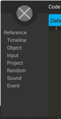 It might be placed between “Input” and “Project” ?
 -
I can’t understand why you can’t highlight a part of a text, and change the color of it, without effecting the whole text?
OBJECTS + FRAMES (Some Useless Info. as well)
-
You should be able to treat the origin of an object just as another object, that means being able to move it around using keys and coded in inputs. The origin really is an important feature that could effect your project since it would be the location of your objects, yet wouldn’t move with the objects, and it’s the center where things rotate around as well.
-
When highlighting text in a script, you can’t move it around by dragging it. Why so? I, speaking on my behalf, think that it would be a good shortcut, faster than having to select, copy, delete, and paste a certain code only 2 rows up

-
When selecting a group of frames, trying to expand them all at once doesn’t quite work as anyone might prefer it to. What I mean is, try selecting a group of frames, and try expanding them all at once like this:
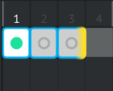
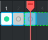 Only one frame would expand
My suggestion is making multiple frames expand at once if the Wick user drags the expand button “far enough.” For example, if two small frames were selected, and you’d want them both be three frames long, multiply two by three, and drag 6 times far to expand them both. See what I mean? Anyways, moving on . . . -
After frame 220,752 (a frame where I think no one would reach, or think about trying to) the vertical lines start to disappear. This shouldn’t be a problem at all, I think I’m just being picky about suggestions

Also, around frame 352,000 to frame 355,000, the frames start becoming squared. I should stop mentioning frames by now . . . -
I found a way to make opacity more than one
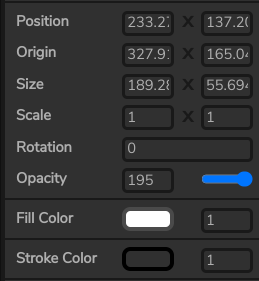 So, since it is possible, let it be a suggestion
I honestly can’t see what could go wrong with a too high opacity. In fact, it would be cool if the object would be blurry after getting a higher than one opacity! It could help with a “glow” effect that was suggested on WE’s forums before! -
I have this note randomly put in the lists of suggestions to just know who really read through most of it. If you got this far, and actually read through my suggestions, thanks a lot! Comment an upside down smiley face to let me know that you’ve read through it
-
Why can’t someone name multiple objects with the same name? Rather than making var wall = multiple stuff, and have multiple hitTest function, then when there’s a mistake, you’ll need to look through everything, can’t you just give every wall the name anyone would give to a wall? Multiple objects with the same name might just make life easier

WICK (MORE FEATURES)
-
Hey, I know we could customize short-cuts and change the onion- skinning, but Wick feels pretty empty. Rather than have Wick be “black and white,” we should have a section in the preferences section for customizing frames and the color of the timeline, and buttons. Add some colors, bring some motivation

-
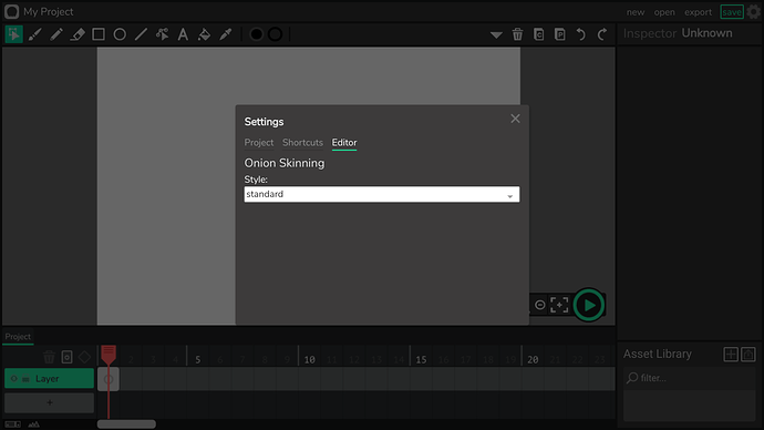
The settings: editor section is pretty empty as well! Something I’ve suggested when 1.16 was around was an eraser that lowers opacity of objects rather than deleting them. Now, the puzzle pieces fits together perfectly, and I have a complete idea of how that would look like. First, you would go to this section:
And then, you’d find an eraser section. The options would be: solid eraser, or light The light eraser option is the one that makes the eraser lowers the opacity, and from the section (just like how you could choose color for the onion skinning part) you could pick a number of opacity that the eraser would lower per second.
-
I’ve mentioned before group projects, but also reading through the WE’s forums, I remember finding a post about a group button was mentioned before here:
I found this thing on the forums called "groups"
Looking at it, it is possible to see that an old attempt was made to make group projects (correct me if I’m wrong). Since the only group there is is the moderators, I was wondering if sometime in the future, if someone would have enough “trust” he would be able to make groups and share latest version of a project that the whole group could work on, and chat about in some type of group private chat? Doesn’t sound bad after all

LAST SECTION
-
Templates? I’ve mentioned it before, but this time, I’m speaking of a different type of templates. The last time, I’ve mentioned templates that has to do with drawing, like graph paper and blueprints, but this time I’m speaking of templates for creating a game. For example, once you click “new” to create a new project, it could ask you if you’d like to use one of Wick’s templates. Each template would include an empty menu, an empty “how to” section, an empty “credits” section, and a totally empty slide for creating the game! I’ve actually tried creating one so that I won’t have to recreate these slides, and anyone could actually feel free to use it! I’ve put a quick rolling ball game to show where it really should be placed. Here it is:
template.wick (69.8 KB)
(I used a website for the alert in the second frame, you’ll find the website in the credits section, also, thanks to Revon for helping me with the alert. He discussed it here:
Sweet Alert - Importing JS Plugins
His project helped, and I just played around with it to make it a more complex alert) -
I’d be guessing I’ve mentioned all the suggestions I had in my mind, other wise, I’ll just edit this post rather than making a new one. Let me know if I’ve made any typos, mistakes, or really useless suggestions. Online schools about to end
 Summer’s almost near
  stay home
  and have a good time!
Pick which numbered suggestion you agree with most, and feel free to be biased! Side notes don’t really count in the numbered order . . .
- 1
- 2
- 3
- 4
- 5
- 6
- 7
- 8
- 9
- 10
- 11
- 12
- 13
- 14
0 voters


