Loving the progress on 1.17!

Hi! I’ve been following WickEditor and for a while and I’m finding the development awesome. I thought I’d share my thoughts/experiences here instead of clogging up the proper 1.17 thread :slight_smile:

The interface is coming along nicely. I like how easy it is to extend the exposure on frames by dragging them. Each new version adds to the control of the features without cluttering up the UI.

Drawing tools are barebones, which is a good way to start. I’d rather see those refined before new features. Personally I’d collapse the Line, Rectangle, and Ellipse into one Shape tool, add a way to toggle Stroke or Fill off instead of picking a color with zero alpha. All the settings with pop up sliders could use up/down buttons for precision or at least change with the arrow keys for faster editing. (Tabbing between entry fields already works. Might be an interesting way to call up more settings)

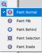
The Brush keeps getting better since pressure sensitivity was added. I like the addition of Brush Modes but would rather see Draw Behind instead of Inside/Outside. That way full strokes are preserved and can be manipulated after the fact.

My biggest issue, honestly, is with the Cursor. It makes huge boxes for selections. A slight tint or outline would highlight better and be less confusing than multiple bounding boxes. Being able to move the pivot point would make for easier transformations and being able to skew would make for improved tweening.

One small bug I’ve found is I have a shortcut key on my Cintiq for Undo which does nothing. Typing ⌘+Z, what my shortcut key is set to, works normally.

Using gifs as clips is more efficient than image sequences, (importing a sequence was easy but adding each drawing to the canvas for every frame is tedious and fills up the asset library) however I tested it with a bouncing ball animation and saw a significant quality loss compared to individual images. I’m assuming for interactive HTML5 files that drawings made in the editor will load faster, result in smaller file sizes, and maintain quality better than imported images. I don’t know for sure, but that’s my educated guess.

I’m an animator who really wants to play around with HTML5 interactivity. The death of Flash was sad news for creators and the ball has really been dropped on moving to a more secure standard. I stopped updating Adobe before they switched to subscriptions. Animatron seemed promising but kept losing features due to instability. (Actions reduced to opening URLs, can’t even make buttons with mouseover states, puppet rigging tool was removed about as fast as it was rolled out, etc.) Most other apps I’ve found either have limited drawing functionality, (Hippani Animator, Tumult Hype, Saola Animate) are meant for banner ads, are game engines that require importing graphics, (Stencyl, Construct 3, Gdevelop) or expect you to do everything in code. WickEditor is more the kind of app I’m interested in. Free, open source, uses JavaScript for coding which is easy to find documentation on, and comes from the spirit of making creation on the web fun. Thanks for putting such hard work into WE and I look forward to using it more as it grows! :smiley:

4 Likes

Same here! Lxapodular, sorry if my last post was a little harsh on the editor. Love the progress as well!

1 Like

@NoRights and @Monaco1 posts like these are awesome, and very much appreciated! We’re tidying up 1.17 now, but hopefully we’ll be able to sneak some improvments to these in the 1.18 release. I’m sure there are a number of these features that we could get in!

Be sure to keep sending this feedback in! We review it all!

2 Likes

Combining the line/circle/square into a shape tool or a menu is confusing for beginners because menus aren’t obvious, and it’s annoying for experienced users since switching tools is 2x slower. Not all users want to memorize shortcuts.

I support buttons next to the sliders, sliders are a hassle for small adjustments.

If the “Undo” function on your cintiq is predefined, it may work to change it from “undo” into a key combo of “command-z”. My wacom has a bunch of built-in commands that don’t work in any program, so I manually change them to key combos.

2 Likes

I was super confused with brush modes at first, but I think I get what they mean. I’d like to suggest to make the thumbnail of the brush mode the same as the current setting so it’s easier to know what it is without clicking it to see.

3 Likes

That’s a good suggestion.
As for the confusion, comparing them to the flash brush modes, the Flash ones are clearer since they use more descriptive words:
flash brushmodes

I’d suggest changing the names of the Wick brush modes to “Draw Normal”, “Draw Over”, and “Draw Outside”. The 2nd wick brush mode name is currently “inside”, but that isn’t the most accurate since you can draw over two separate shapes with the 2nd brush mode (unlike Flash, it’s not confined inside the first shape you started drawing in).
Wick brushmodes
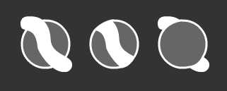
I think the icons could be improved too, like this.
sugg Wick brushmodes

5 Likes

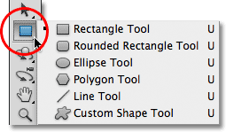
@HOTS I suggest creating a Shapes tool because effectively they’re all customized Lines and Paths. It’s redundant to have multiple tools that do the same thing. I get that generating primitives is a good starting point for beginners but it doesn’t have to be confusing or take twice as long. Look at Photoshop for example:
photoshop-shape-tools
There are two things I’d like to ask about: Intended Audience and Standards

Who is the intended audience for WickEditor?

Is it beginners, school kids, maybe people on mobile devices or older computers, places where they can’t download software? Folks who have never tried animation or scripting before and are only starting out on their creative journey?

I’d say they’re the primary crowd that’s looking for a free web app to experiment on. Then you have other groups who are old hat, know their way around Adobe products, maybe a few who got them from Macromedia or even earlier. They’ll play around, test it out, maybe sing it’s praises when it does something one of their premium apps doesn’t. Their expertise and input can be useful but I’d be careful not to burn time implementing advanced features over refining basic tools.

Then there’s standards. If WE is your first animation app or even first art program then it’s important to make things easy to understand. If you’re coming from similar places then it behooves us to not reinvent the wheel too much. We should also think about WE as a jumping off point. Maybe somebody makes some projects, discovers they like coding, and goes on to learn all the stuff under the hood. In that case we’ll want things to track with how the web works outside the program. It might seem early to discuss that but consider how much of Internet history is gone now because one company didn’t keep their plugin secure and current.

I think WE is still figuring out what it wants to be, which is good! Remember when Photoshop had to deal with people wanting to pack animation, 3D, everything and the kitchen sink into it? GIMP has been compared to PS since day one, yet there’s also a painterly fork of it. OpenToonz Morevna Edition adds MyPaint brushes and other features to a program used for Ghibli films. That’s the wonderful thing about open software - anybody can help adapt it to suit a need

2 Likes

Photoshop has to shove tools into menus because it has 70 tools. Plus PS is not primarily a vector drawing program and squares/circles/lines aren’t as useful as in Wick.

Maybe in 3 years when Wick needs space for more tools they can combine the circle and square, but for now the tools shouldn’t be buried behind multiple clicks. In newer versions of Flash the circle and the square are in a menu, so I use shortcuts not by choice but because clicking them is so annoying. Function > Form.

1 Like

I think it makes more sense to have the circle, square, and line tool all exposed by default, because it opens up those tools to newcomers a bit more and keeps those features from being hidden. However, there are other ways the editor could save space. For example, most of the space in the top bar is not being used for anything.

Also, I agree that importing image sequences (PNG, JPG, SVG) as Clips like with GIFs would be super helpful!

1 Like

Guess we’ll have to agree to disagree on this one. I don’t consider nested tools a deal-breaker, personally. As long as the most common ones are up front it’s never been an issue. The button could even be coded to make the tool selection before releasing the click if it’s a problem. Of course I also prefer to freehand when possible since I find perfect shapes sterile.

Have you ever used the infinite canvas app Mischief? It’s vector and the brushes, while seemingly barebones, are so easy to tweak and sketch with. Sadly it’s no longer being developed. Leonardo is similar but bitmap. (And currently PC-only, which is a bummer since my main machine is a Mac :p )

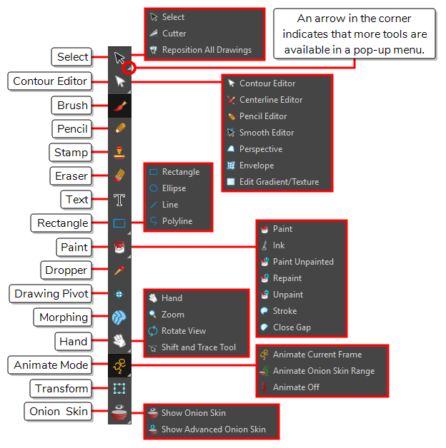
Toon Boom Harmony has both though 90% of the time I use vector to see how far I can push it. Again, I don’t find this menu hard to navigate and I appreciate moving more advanced features out of the way unless you need them.

Perhaps the best compromise would be to adopt Workspaces where users can switch between layouts for different projects? That way game makers can prioritize a Rooms window for managing levels, cutout animators get a beefed up Asset Library view, people could have a dedicated Shapes toolbar if they want. Preset and custom Workspaces with draggable windows, toolbars, and icons for more professional users, default for beginners.

1 Like

Have you considered a standalone electron release?