
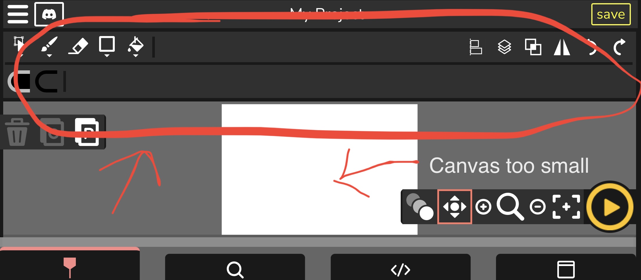
I’ve just tested Candlestick on mobile and to be honest, it’s pretty annoying to use. Not impossible to use, but just not efficient, unlike desktop.
One factor for the lack of efficiency in mobile is the menu organization, as the top and bottom menus of the editor takes up too much space, in way of the canvas. One way to make it easier to us the editor in mobile is to make the top menu (where buttons such as the selection and brush tools are located) collapsible, as when hidden it would give much more room to the canvas.
Users on mobile should as well be able to zoom in the canvas by using one finger from each hand and move away from each other (pressing the screen) and in order to zoom out, follow the same procedure but rather move towards each other (rather than having to the buttons in the bottom right corner of the canvas to zoom), like that of FlipaClip: https://jumpshare.com/s/GePixWbiX4opPgcsybIB