►►**Brick Player share your animation easier!** ◄◄▶NEW UPDATE◀

Hey guys!

So I have seen you guys make a lot of progress with Brickstar, ofcourse.

I also want to help, I know this is really late to ask, but I can help with designing and stuff.

Here, I made a logo for the Brick Player:

Here is the logo for the version 2.0:

This design looks good because it is elegant and looks stylish for the platform. If you guys and Brick like it, you can tell if you want the color to be changed and I can send you this.

Pranav

1 Like

Doesn’t really fit with the blue in my mockup.
Try replacing the black with white and the red with orange

1 Like

This is for the actual platform itself…I’ll wait until Brickstar replies and what changes HE wants, but if you would like to custom it, here is the template:

All the directions are on the template! :slight_smile:
Brick Player Logo Template6-14-2022_15-42-20.wick (14.0 KB)

Also, if it does not let you change the color, delete the selected item and undo it (Ctr + Z). It should probably work then.

1 Like

I like the logo! I’m going with it thanks :) and of course you can help desining! i saw your work and it is Incredible

You can create a new ui or fix the other ones :) we will pick the best of the 3 :) also i would be VERY Happy if we could use one of your animations to show of the new version

I wish you all a great day :)

1 Like

try replace the black with white
and make the blue a bit darker
then it would go perfect
also, bug in my ui on the player, text doesn’t fit on screen

1 Like

Yes, of course!

Just post the screenshots of the parts you want to redesign and I will try my best to do it!

1 Like

We will wait till we have voted on the UI maybe @Pranav_Diddi is deciding for a other color sceeme. so yea we will wait and see so everyone here has a fair way to Contrbiute to Wick ( also sorry for my Grammer Gramerly randomly decided to not work on wick )

1 Like

Also It would alos help, Brick, if you tell me what type of “theme” or “vibes” you want to give off when I design the specific parts of the platform

1 Like

I would do the screen shoots but i noticed that i could improve on nearly everything from my Version. i think the vibe should be Modern and simple. also for colors i thought since it is for Wick Animations maybe we could go on the Wick Colors but its really up to you i’m happy with everything that has ben created so far so thanks to @Watrmeln for also bringing an good alternitive version ( i think ist beter then mine )

1 Like

So just do what you want and we will decide with the 3 choices we have and maybe we can combine all 3

1 Like


oh yes.

OH YES.

2 Likes

Also @Pranav_Diddi i was looking through your youtube channel the other day are we allowed to use an video for the Promotion video of BrickPlayer MP4

BrickPlayer MP4

1 Like

Hey Guys,

If I could ask, did anyone except Watrmeln start to work on the other features to do (Sound compatibility and show / hide Cursor)?
I am asking because the work on the UI of the BrickPlayer seems quite advanced.

If nobody has started, I would do the sound compatibility. But I’m really busy with another project of me so it could take a while.

This would be great! i dont think that anybody on the team is going for it right now. because we have mostly designers

1 Like

Hey guys!

So I am working on the logo and I animated it, but there is an issue.

The text is italicized, but when I export it, it is not, can anyone of you guys know how to fix that?

1 Like

Could you post a wick file or a picture / gif of it here so that we have more informations about it?

1 Like

Ok, so this is what it is supposed to look like:
Screenshot 2022-06-15 2.12.46 PM
As you see, the text is italicized

But this is what happens when you export it:


As you see the text is not italicized when exported.

I tried multiple times to export it but it is the same.

1 Like

Like I see the italic text is in a clip. I managed to recreate the bug and found a solution.

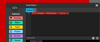
Give the italic text a name and then add this line of code to the default script of the parent frame:
this.textName.fontStyle='italic';

But don’t forget to change textName to the actual name of the text.

1 Like

I tried it but it says there is some error.

1 Like

Can you make a picture of what the console says?

1 Like