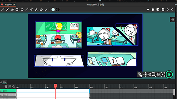
Not necessary, just every box animation should be inside a clip… I can later add the transitions… What I mean is you don’t need to animate the order in where the animations starts… I can do that programatically.
ouh… :o so…thats mean that … all box (clip) in one layer?
Don’t worry, just leave it as it is… that works as well. : ) Thank you!
New enemy idea: A Mortar
More Info & Wick File
References:
Wick File:
Enemy Design - Test2.wick (7.3 KB)
Wick File (Black & White version):
Enemy Design - Test2.wick (7.1 KB)
The wick file is only to show how this might work in the context of the game.
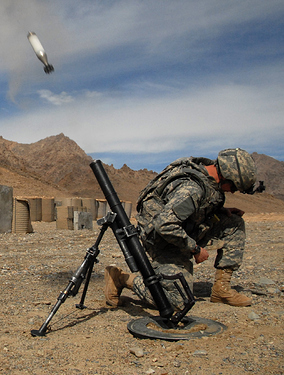
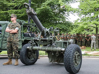
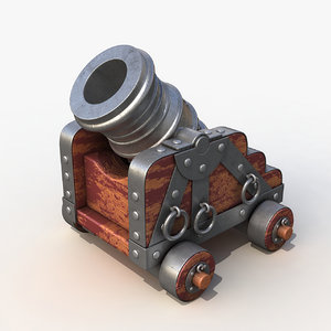
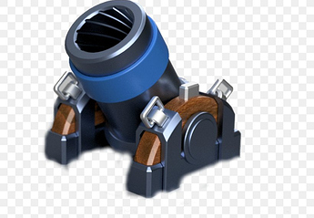
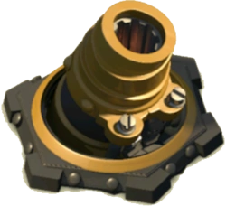
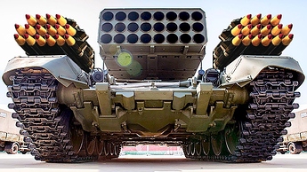
Here’s an example of a mortar used in the real world (no need to watch full thing).
The mortar:
Advantage:
- Huge range
- Great damage in landing area
- “Impulse” effect (in landing area)
Disadvantage:
- Slow & the shot goes over objects (only objects in landing area or close to there get damaged)
- Needs to reload after every shot
- Can’t damage player if they’re too close to (creates a safe zone)
- Can’t move (tires could be added to change that)
This is a simple idea that might need some adjustments, I’m not sure if it’ll work well
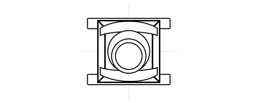
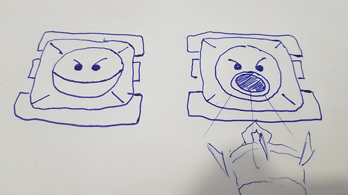
The drawing of it I made is from top view and it’s not so perfect so it might seem confusing
That’s why i added references to this post
That will work… thank you so much.
I know that this started like a real tank game, but in fact I don’t like war. Im moving the game from that. Im adjusting the drawings to be more fantasy and less real war tanks. Not sure if that makes sense. It will be good if we could put cute faces to the enemies as I did with the first Boss.
Example… the mortar could be transform… (something similar to this)
I loved what you did at the wick file… I’ll think in something to give it movement… I’ll work this today.
Ok, here is the mortar…
It will behave the same as your description, but it will be stationary until the user gets close to him (to his weak area) for a couple of seconds. If the user is still within its weak area, then it will rotate his body to fly to a new location.
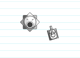
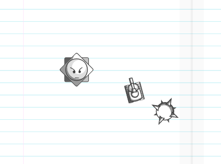
What do you think?
It looks amazing!!
I like how you made it look more “cartoony” and gave it a face, it fits more this way with the idea that these are drawings on a page.
I’ll try to keep your edits in mind for future enemy ideas
Do you plan to have the weak area for the mortar visible/ marked in some way during the gameplay?
(I’m just asking out of curiosity)
No, you mentioned that since there is a limit close to him in where the bombs don’t hit the user, that is what I’m calling the weak area… not visible, just your idea on how to kill it… that is why I need him to move to other area, because if not, it will be too easy to kill.
Enemy roster so far, two small enemies and one boss.
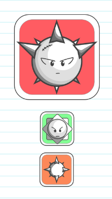
HzMortar (Hz named after @Hamzah_Alani) Its clip name is hzMortarClip) is still under development. The other two are fully developed. The other enemies ideas will be implemented after I finished with this one.
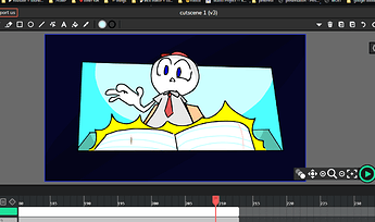
im really happy and enjoyed  that the cutscene is finished animated and coloured…so here the progress :
Absolutely beautiful. Well done… I think it is completed right? Do you think that there is something to else add?
yup , it completed and i think …there no anything else to add, for now… 

I know I’m not working on enemy designs, but I have one. (I hope that you can make it look better)
My Project6-14-2022_22-34-36.wick (213.2 KB)
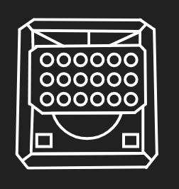
The Mega Launcher (you can choose the name)
What Does It Do?
What it does is that I will not move. It will stay in a spot all the time. It will launch many missiles but it will have a predefined time in which it will launch them so, if it launches one and it lands, it will launch another one but 1 second later. It takes 15 seconds to reload or 10 the missiles will not take as much damage away because it launches a lot
If you need any more info you can tell me
hmm I have to say it’s kind of like the mortar
Maybe this could be like an upgrade to the mortar
I really appreciate the idea… but I’m trying to move away from a war game so this could be more like a fantasy game.
and I’m trying to keep the team to no more than 5 people so it could be managed and controlled easier…
Yeah that’s why I decided to make the missiles be a ball instead, and maybe I would change it to look less war-like
@bluethe_bot_academy
Thank you so much, I think that we are doing a beautiful game. I’m really glad with the results… from my part I’m still programming enemies… but there are some small drawing / animation tasks that you could easily grab if you are interested in having more participation…
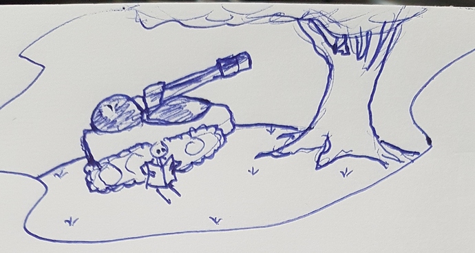
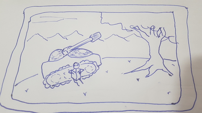
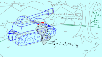
Here is my design for the game’s main title screen… I think that you can take this design and create something great…
To be consistent with the rest of the game, the background will be in notebook lines and white (I’ll add the background, you don’t need to draw it), but the intro screen could be in a card (like the enemy cards)…
Update: (Adding more details)
The card should be full color and maybe a little bit animated. (animations only on tree leaves, grass and maybe the user like passing pages, nothing else.). I’ll add the notebook background behind the intro card with the game logo (I’ll also add the letters for the game logo)
About the tank color… I’m still don’t know… not sure if we could leave the tank blank and white and the rest of the intro card colored… (you could try different combinations)
Just my opinion but wouldn’t the shop button be on the smartphone screen and you would have to click on it
sure >u< ,
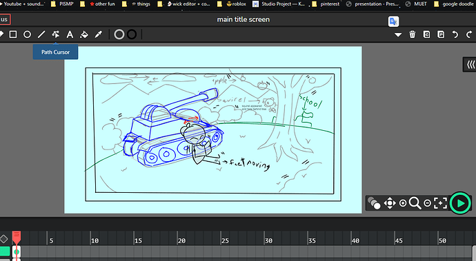
so here my idea :
main title screen6-15-2022_11-35-20.wick (93.3 KB)
(ouh and i rarely draw tanks but i’ll try my best :D )
err …like this: ??
eik i just read this after i done sketching  …now i get it what you actually mean :D thanks >u<
i got 2 different idea ,
first : the tank color gonna be green like the real tank…cuz (the tank was left on the hill , and the main character found it)
sec : the tank color gonna be black and white (and its color opacity low a bit ) and with animated yellow sparkle (cuz it magic)…cuz it was came from book

