you know the fake editor you used for the first scene? maybe that editor’s forum.
Yes. YES.
(Also welcome)
I feel like the name, “Forum Fighters,” implies more to the forums than it does to Wick Editor.
Also, Forum Fighters won’t be the first software with the word “Forum” in it. I think that rule is against using the “Wick” part in a domain of a site that’s closely similar/ related/ alluding/ etc. to the editor.
I added the black spikes. I just left the letters of forum plain white since it already looks good like that.

I also tried to have separate Fs

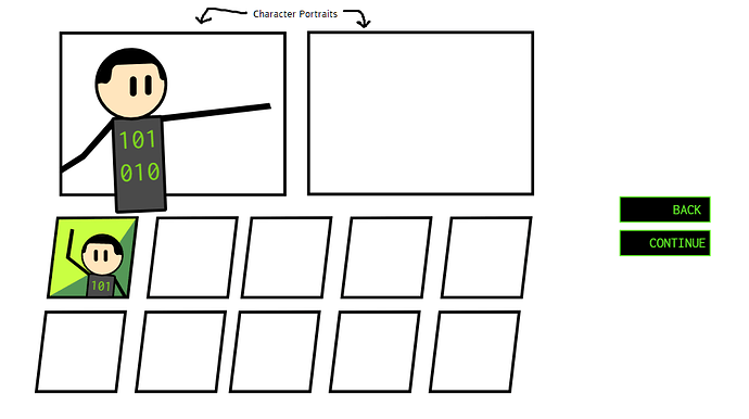
So what would you guys think if the character select is arranged like this?
its unfortunately very barebones at the moment. I’m going to worry about its look later.
Wait, I forgot to remind you all.
The base version of FF is NOT going to be 2-player one keyboard.
The controls of FF is similar to a third person shooter instead. Having 2 players on one keyboard limits possiblities.
So untill the base game is done, we shouldnt be making assets suggesting 2p
Also
Excellent work @KringlePrinkles . Your work NEVER fails to impress
(I do like the connected f better)
Now, what was the name of your robot again? ,:)
What do you think about adding an online leaderboard? This way I could actually contribute my back-end skills.
@mlgcoolguys_1 The robot fighter is Bukzerik, why’d you ask?
Meanwhile, I’m albeit stuck at the moment on what to add or change. So you guys can help yourselves out with fixing, mixing, or changing things up.

 (dont worry about the v4.0 suffix, its just me trying to organize)
FFR 1.2.0 v4.0a .wick (215.1 KB)


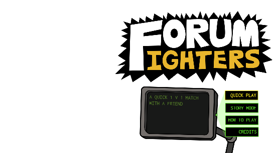
I’m pretty happy with the main menu buttons, even manage to make a jittery info monitor
(though at this stage, I think it might’ve been unnecessary to add).
If you didn’t like the moving object, I have a version without it:
FFR 1.2.0 v4.0b .wick (212.8 KB)
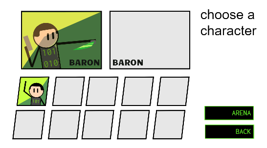
Unfortunately not much has changed in the QuickPlay’s character select. Its as barebones as ever, and only had Barons portrait on it.
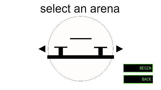
When moving from there towards the arena selection: since we only had test rooms atm, I made a simple arena selector for choosing maps. It looks as simple (and sadly unstylish) as everything so far.
Though if you think this is not the way to go, you can implement a different way of choosing arenas.
meanwhile @nuggetofwisdom, there are many other ways you can contribute! Maybe you can give a spin on designing the ‘eye candy’ for the menus, since they’re mostly in their visual minimum. At this stage of production, I don’t think (in my opinion) the online board that much important, although that is interesting to think of…
…Well I’m going to sleep! seeya’ll in the mornin-
hold on I just realized I wasted the entire time making the main menu buttons look better
*facepalms angrily
FFR 1.2.04-19-2021_10-37-02.wick (225.8 KB)
made some slight ui changes (mostly motion stuff)
So yeah the buttons move now
Have a good night and I hope you sleep well!
So here are my ideas for the menus:
I was thinking we could make a mouse parallax effect on the menus like seen here:
And I think at the start menu we could have two bots fighting two the left.
Also could somebody explain the bot workflow (How they work) so I can make a visual workflow?
Just wondering, who’s currently working on the project (code-wise)
I’m ready to help them with anything if needed
Working with servers is my weakness, but if you know how to do this, then feel free to do so after we add some type of point system
Also, like @KringlePrinkles mentioned, there are all types of ways to contribute. So, if you don’t feel like your doing enough, you can always ask trio for somethin to do
I can probably make the aforementioned menu eye candy
i already did some in post 674
i spy with my little eye some stuff to do, off I go >:3
I like how the letters on the buttons tweens to the right, I will try to apply that to all the buttons (with a transition back to the ‘up’ state)! though I heavily despise that pulsating effect you gave the title art. It doesn’t look good on the eyes.
You can remove that, just wanted to test the waters to see if any1 liked it
(also try to implement sweetalert.js somehow i like it)
On the one I did, I can add Wat’s the button tweening after

i thought it would just be more convenient to use my update so you only have half the work later. Also @mlgcoolguys_1 if you do use mine remove the tween pulse on the title for KP
Also @KringlePrinkles i found out that  goes really good with scrolling credits scenes like the ones in the OG FF and Square adventures
ok ill work on wat’s version

