I made a fork of Wick at https://github.com/kryptot7/wick-editor! It’s my first time contributing to an open source project on Github, so pardon any dust  The highlights are a sleek UI overhaul and several other improvements relating to the inspector, color picker, and timeline.
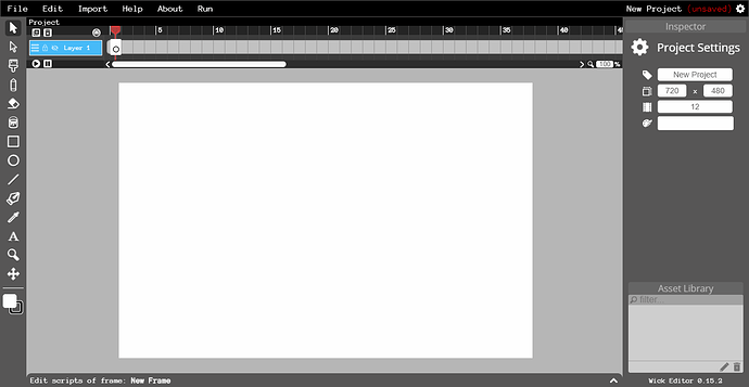
Before
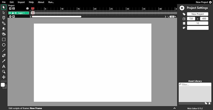
After
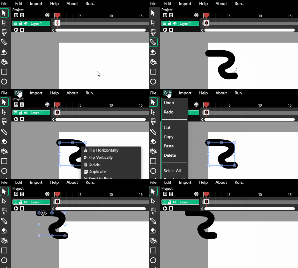
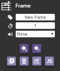
Inspector Styling
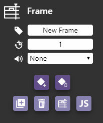
Trimmed-down Color Picker
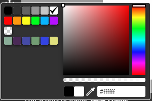
Loading font…

Changelog
- Dark theme that makes heavy use of CSS variables for easy customization
- Cleaned up and/or redrew all Tool .svgs, removing all shadow effects (which showed up as vague fuzzyness due to the small size of the icons)
- Changed font from Anonymous Pro to Segoe UI (Windows), San Francisco/Helvetica Neue (Mac), or sans-serif. I think this is more readable. You can change it to whatever you want by tweaking --ui-font in editor.css.
- Smaller, space-saving timeline
- Timeline can now be resized
- Fixed some timeline bugs related to resizing
- Got rid of “Inspector” label to save space, as I felt it was redundant
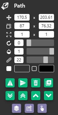
- Input fields in inspector now have styling
- Menu bar behavior is much more intuitive. Mousing over other menus while one is open behaves as you’d expect.
- Menu bar selections and right-click menu look better now
- Added ellipses to various menu items (like “Export…”)
- Various capitalization fixes throughout UI
- Alert box now tells you when a web font is loading or when loading fails
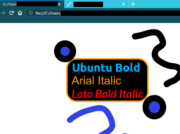
- Fonts in inspector now load proper bold/italic variant (#768)
- Tweens now have rainbow colors, just for fun! (this may have a small impact on performance, though)

- Better color coding of buttons and highlight colors
- Script editor API headings don’t clip on bottom anymore
- Fixed color picker not closing (did I cause this bug? idk. well I fixed it!)
- Got rid of color picker close button, it now applies new color on clickout (thanks spectrum.js!)
- Color picker is more compact now (I love saving screen space)
- Alert box showMessage function is more versatile
Let me know what you think of these contributions and if they can be merged into the main repository! The default branch in my fork is called ‘all-improvements’ and it’s based on the upstream branch ‘151’.


 The viewport background isn’t exactly solid black, but it’s pretty close. How’s this?


 I’m aware that the next version of Wick will be an overhaul, but this can be a nice update inbetween then. It could also help inform the design of the next version (like using more CSS variables, the resizable timeline bugfixes, etc.)

