I’m planning on making some loading screens for ever character in the game and roster.
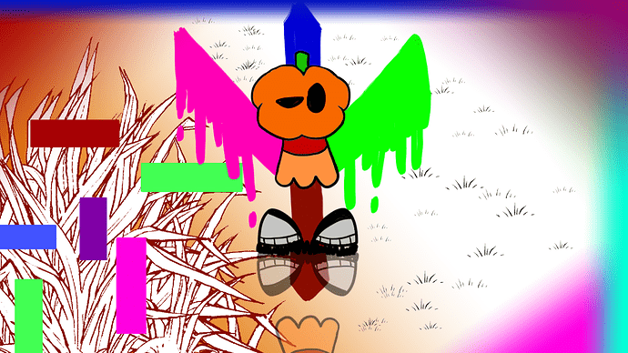
I created @pumpkinhead’s loading screen!
The side with grass is reality. The other side represents… glitches. I made it like that because when you code for the first time there HAS to be glitches in your first game, and it represents Temperi, just like Baron’s loading screen (every single loading screen featuring a character has a background referencing Temperi)
I don’t know if it’s as good as Baron’s background. I’ll probably make some… “adjustments” later.
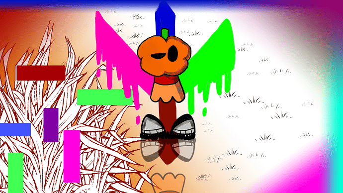
Okay. This time I fixed some mistakes like the lines being smaller. I also added some better shading.
Edit: Nevermind! I decided that Pumpkinhead’s loading screen should be at least almost as colorful as Baron’s.
Should be easy to add since we already have a “remap keys” option in the settings
I used this file:
Remap key settings should work now:
FFR 1.5.wick (2.7 MB)
I also noticed that the coin thing (character select screen) is missing in this version
Someone must’ve updated the wrong version, @KringlePrinkles’s last update had the coin thing (along with other changes), so I think we should go back to that version before making any more changes.
So I decided to update that file instead, and while I’m at it, I wanted to add a timer to the game, you know, just to rush the players a bit, since when I was testing this game with my brother (who beat me) I noticed that a player could keep on jumping all over the place to dodge shots when they’re at low health.
Maybe with a timer, the player with the lower health will be the one to rush the other.
I still don’t know whether to just have the player with the lower health lose when the timer ends, or if we should throw fireballs from the sky (depending on the map), or if both players start losing 1’s from their health slowly until one dies… I think the fireball option would be good (the other options might have some confusing results if both players had the same exact health), but I’ll leave it up to you guys to decide.
Here’s the file:
FFR 1.5.wick (2.7 MB)
The “timeLimit” variable is currently set to 3 minutes and can be changed in the default script of the first frame.
The timer is also inside of the “camera_border” clip in the top layer
The code for the timer is pretty simple to understand, here it is:
Update Script
var _cfn = project.currentFrameNumber;
if(Math.min(16,Math.max(6,_cfn))===_cfn){
    this.opacity+=0.3;
    if(!project.frozen)
    this.sec=Math.max(0,this.sec-1/project.framerate);
}else{
    this.opacity=0;
    this.sec = (timeLimit*60);
}
var stepA = Math.round(this.sec);
var Minutes = (stepA-(stepA%60))/60;
var Seconds = stepA-(Minutes*60);
this.txt.setText(Minutes+":"+(Seconds<10 ? "0"+Seconds : Seconds));
this.txt.x=0;
2 things
- the win music doesn’t exist
- updated version number and timer design, and idk how nobody noticed this but the cam border wasn’t on the front layer, which caused players to see things that they shouldn’t have
i also added a Low performance alert to the fps counter if it drops below 8
FFR 1.5.1 - Nightly 7_27_20227-27-2022_16-47-03.wick (2.7 MB)
PS @KringlePrinkles
I made a modified version of cheese space venture that uses a more realistic guitar and slightly modifies the drums
to pitch up the guitar change the unison from fifth to none
FFR 1.5.1 - Nightly 7_28_20227-28-2022_22-24-59.wick (3.3 MB)
(this is a feature test build, not final, when modifying please use the file in the last post)
@Dol_Boonsomchin i tried putting your loading screens in action, however they pump the filesize up a bit, so we’ll have to externally store them. for now, i redid the layout and added your screens.
Project leads please provide feedback.
My bad! I tried putting the size of the project canvas while drawing the loading screens, as I thought it would fit perfectly. Is there anything I can do to actually get the loading screens in?
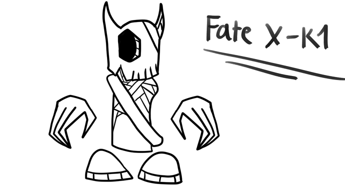
New character (possibly new boss) concept art! (I’m leaving the color design up to other people)
Haven’t planned out the attacks yet, though. However, this guy has the ability to control Fate, Probability, Thoughts, and more! (Let’s make his boss fight even harder than bullet heck)
Edit: Oh, and let’s make it so that there will be a decent chance that he gets a power up that restores him to full health.
Few things about this.
How is he digitally themed? (Other then its name)
This isnt a bullet hell game, it’s more of a… Metrovana… Kinda. But it certainly isn’t a bullet hell.
If a boss is able to regen health, it has to do so SPARINGLY. If it happens too often it can drag on and make the fight unfun.
Examples of good ways healing can be done on bosses:
- The boss is low on max health, but If you don’t take him within ___seconds he’ll regen and you have to start over.
- The boss has a long charge up time for its heal and you need to do something technically-difficult to stop him, or risk him undoing large amounts of dmg.
- If The player makes a mistake, such as getting hot by the boss, then yes the boss can heal off the player’s mistake.
- By using Slow consistent regen, you encourage the player to not let down their attacks. Since the player has to be consistently doing dmg to win the fight
Imagine from the player’s perspective that after doing 90% of the dmg needed, only for the boss to heal to full BY CHANCE x-x not fun
But… It’s a fairly nice design, it’s line art gives the skull depth, it’s sharp edges on its skull and hands have off signs of danger. However I feel like the Sash and the shoes seem out of place and for a tough and battle hardened character. Also, noticed that it’s modeled after madness characters, which is Interesting AND you have shaped her chest in a way suggesting that fate’s a female, just to note.
So, over all good design, I’ll consider her during my world building. Her battered and self-repaired design is interesting to apply.
 Well done!
Also… @KringlePrinkles @pumpkinhead @Hamzah_Alani @BaronAWC .
May I ask how your worlds have been treating you? (Or in simpler terms: how have you been, I haven’t really seen you guys in a while)
Finishing all the animation collab parts I joined for. And by that I mean I have one left that I have to send before September 13 (hurray!!!).
I told myself I’ll study programming after this.
Honestly I am unsure (or forgot) where to go next, haha.
I’ve been focusing alot on my Fredric Gems game.
I haven’t checked on this topic for a while to be honest
Characters from a flash cartoon madness combat. they have the same proportions as fate x-k1
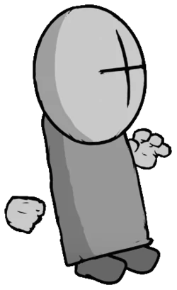
This game is about people fighting in a digital world. you would have to make him/her fit with the digital world theme.
@Dol_Boonsomchin for your boss/character, what do you mean by fate/probability and stuff like that? how specifically will it work?
also, making the fight harder than bullet heck games is probably not very good since i don’t really want to target this game away from… normal people, or something like that.
I’m doing fine, just tired and a bit busy. also unmotivated woohoo. my websocket quacking thing stopped working for seemingly no reason and i didn’t change any code… woohoo… surely i’ll figure it out at some point.
Yeah I’m fine, it’s just the same problem I have with every project. I want to work on a project (e.g. this) for a while, but then like few days later I randomly lose motivation, or think of something else I could be working that seems cool, then end up not working on the project indefinitely.
Last time I remember we were working on AI…? Or like… What’s happening now i haven’t checked in a while…
I think jump should be W, interact be E, and attack be SPACE.
And… since when did we have interactables? And… What do you mean this is a metroidvania i thought this was a fighting game??? When did these developments happen?
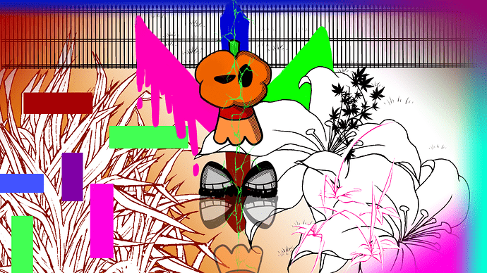
I’m not really a fan of the loading screens, it’s not very good to look at in my opinion. i also don’t see how the background being colorful is symbolic of temperi losing most of themselves. if anything i feel like it’d mean the opposite. also the shading on baron’s skin doesn’t look too great. (and pump kinhead doesn’t have cool looking shoes they’re just very hard solid-colored feet!!!)
well i believe smash does a thing where the playing field gets smaller and smaller. (yes we could consider stealing an idea from another game instead of coming up with our own original ide)
I agree with you on the loading screens. I don’t like how they look and kind of feel. edgy? in a way.
I was just joking, my bad. Though, if you’d like to continue working, that’s your choice.
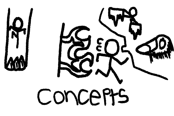
By fate and probability, that’s just how their story is. In the fight however, they can create many casualties, like these ones:
(Decided to draw this in another program) And inside those sections/levels, the player needs to survive for a few minutes or seconds in order to come back to the original fight.
That’s one of his “probability” attacks (he technically just rewrites reality, although this power is limited.)
For his “fate” attacks, (keep in mind his fate attacks usually happen when he’s on low health) he will either lower down the player’s health (halfway down), slow down their speed, or just lower down their attack damage.
I don’t want it to be harder, I want it to be ALMOST as hard.
Temperi (if I’m correct) actually lost most of her code, and the colorful background represents that, as it’s just a bit “messed up” (don’t know how to explain that)
My bad! I just copied the design from the gameplay.

